# flex-grow flex-shrink flex-basis 详解
flex为复合属性,是flex-grow、flex-shrink、flex-basis的简写,默认值为0 1 aut0
# flex-grow
定义弹性盒子项(flex-item)的拉伸因子,默认值0
flex-grow决定了子元素怎么样瓜分父容器的剩余空间,计算方式为
假设父容器剩余空间为X,子元素的宽度为 W1、 W2 、 W3,其中 W1 + W2 + W3 < X,子元素的flex-grow属性分别为a、b、 c,那么子元素分到的父容器剩余空间分别为
a/(a+b+c) * (X - W1 - W2 - W3)
b/(a+b+c) * (X - W1 - W2 - W3)
c/(a+b+c) * (X - W1 - W2 - W3)
例子
<!DOCTYPE html>
<html lang="en">
<head>
  <meta charset="UTF-8">
  <meta name="viewport" content="width=device-width, initial-scale=1.0">
  <meta http-equiv="X-UA-Compatible" content="ie=edge">
  <title>Document</title>
  <style>
    .parent {
      width: 600px;
      height: 200px;
      border: 1px solid #333;
      display: flex;
    }
    .child1 {
      width: 120px;
      height: 200px;
      background-color: antiquewhite;
    }
    .child2 {
      width: 150px;
      height: 200px;
      background-color: aqua;
    }
    .child3 {
      width: 180px;
      height: 200px;
      background-color: coral;
    }
  </style>
</head>
<body>
  <div class="parent">
    <div class="child1"></div>
    <div class="child2"></div>
    <div class="child3"></div>
  </div>
</body>
</html>
上述html页面显示结果如下
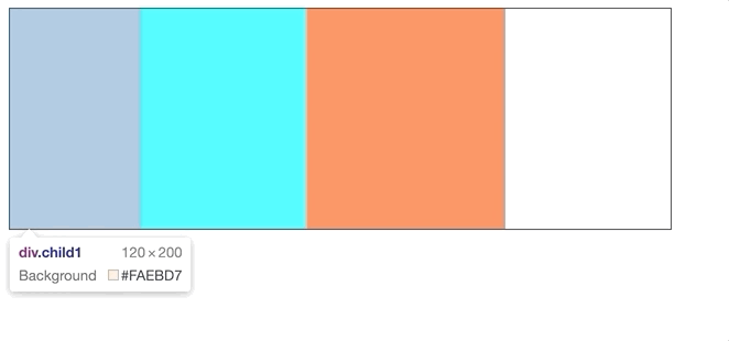
div1的宽度为120px,div2的宽度为150px,div3的宽度为180px,总和为350px,父容器的总宽度为500px,此时剩余空间为 500 - 350 = 150px,也就是最右边剩余白色部分的宽度。
子容器不设置flex-grow时,默认值为0,剩余空间不会被分配。现在改动代码,给子元素设置flex-grow
<!DOCTYPE html>
<html lang="en">
<head>
  <meta charset="UTF-8">
  <meta name="viewport" content="width=device-width, initial-scale=1.0">
  <meta http-equiv="X-UA-Compatible" content="ie=edge">
  <title>Document</title>
  <style>
    .parent {
      width: 600px;
      height: 200px;
      border: 1px solid #333;
      display: flex;
    }
    .child1 {
      width: 120px;
      height: 200px;
      background-color: antiquewhite;
      flex-grow: 2;
    }
    .child2 {
      width: 150px;
      height: 200px;
      background-color: aqua;
      flex-grow: 3;
    }
    .child3 {
      width: 180px;
      height: 200px;
      background-color: coral;
      flex-grow: 1;
    }
  </style>
</head>
<body>
  <div class="parent">
    <div class="child1"></div>
    <div class="child2"></div>
    <div class="child3"></div>
  </div>
</body>
</html>
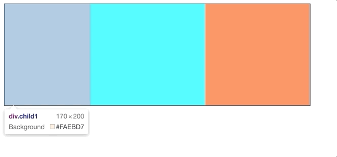
三个子元素的flex-grow分别为2、3、1。此时按照公式计算,三个子元素的宽度分别为
- Child1: 2/(2+3+1)*150 + 120 = 170
- Child2: 3/(2+3+1)*150 + 150 = 225
- Child3: 1/(2+3+1)*150 + 180 = 205
看运行结果
# flex-shrink
指定了 flex 元素的收缩规则,默认值是 1
flex-grow决定了父容器空间不够时子元素如何压缩,计算方式为
假设父容器宽度为X,子元素的宽度为W1、W2、W3,其中 W1 + W2 + W3 > X,此时父容器空间不够,缺少 X - W1 - W2 - W3,要对子元素进行压缩。假设子元素的flex-shrink属性分别为a、b、c,那么此时子元素的宽度分别为:
W1 - (W1 * a)/(W1 * a + W2 * b + W3 * c) * (W1 + W2 + W3 - X)
W2 - (W2 * b)/(W1 * a + W2 * b + W3 * c) * (W1 + W2 + W3 - X)
W3 - (W3 * a)/(W1 * a + W2 * b + W3 * c) * (W1 + W2 + W3 - X)
例子
<!DOCTYPE html>
<html lang="en">
<head>
  <meta charset="UTF-8">
  <meta name="viewport" content="width=device-width, initial-scale=1.0">
  <meta http-equiv="X-UA-Compatible" content="ie=edge">
  <title>Document</title>
  <style>
    .parent {
      width: 600px;
      height: 200px;
      border: 1px solid #333;
      display: flex;
    }
    .child1 {
      width: 220px;
      height: 200px;
      background-color: antiquewhite;
      flex-shrink: 2;
    }
    .child2 {
      width: 250px;
      height: 200px;
      background-color: aqua;
      flex-shrink: 3;
    }
    .child3 {
      width: 280px;
      height: 200px;
      background-color: coral;
      flex-shrink: 1;
    }
  </style>
</head>
<body>
  <div class="parent">
    <div class="child1"></div>
    <div class="child2"></div>
    <div class="child3"></div>
  </div>
</body>
</html>
运行结果如下
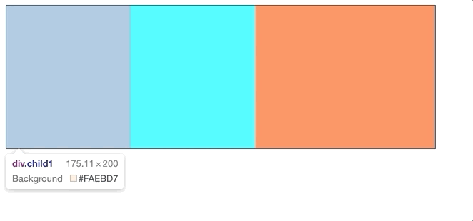
根据计算公式验证一下 1470 150
Child1的宽度: (220 * 2)/(220 * 2 + 250 * 3 + 280 * 1) / (220 + 250 + 280 - 600) = 175.11
Child1的宽度: (250 * 3)/(220 * 2 + 250 * 3 + 280 * 1) / (220 + 250 + 280 - 600) = 173.47
Child1的宽度: (280 * 1)/(220 * 2 + 250 * 3 + 280 * 1) / (220 + 250 + 280 - 600) = 251.42
# flex-basis
指定了 flex 元素在主轴方向上的初始大小
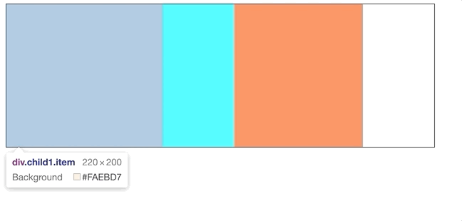
flex-basis指定了子元素的初始宽度(默认主轴为横向),css中同样表示宽度的还有 width max-width/min-width,flex-basis和这些属性相比优先级如下 max-width/min-width > flex-basis > width
例子
<!DOCTYPE html>
<html lang="en">
<head>
  <meta charset="UTF-8">
  <meta name="viewport" content="width=device-width, initial-scale=1.0">
  <meta http-equiv="X-UA-Compatible" content="ie=edge">
  <title>Document</title>
  <style>
    .parent {
      width: 600px;
      height: 200px;
      border: 1px solid #333;
      display: flex;
    }
    .item {
      width: 150px;
      height: 200px;
    }
    .child1 {
      flex-basis: 220px;
      background-color: antiquewhite;
    }
    .child2 {
      max-width: 100px;
      background-color: aqua;
    }
    .child3 {
      min-width: 180px;
      background-color: coral;
    }
  </style>
</head>
<body>
  <div class="parent">
    <div class="child1 item"></div>
    <div class="child2 item"></div>
    <div class="child3 item"></div>
  </div>
</body>
</html>
运行结果如下